Bottle Confusion at Its Finest: Battery Acid That Looks Like a Water Bottle
At first glance, you might mistake this bottle for a regular water bottle. However, a closer look reveals the label boldly stating "Battery Acid." The clear liquid inside doesn't help clarify the situation either. This design choice leaves us questioning the wisdom behind such a misleading appearance. It's a reminder of how crucial clear labeling is, especially when dealing with potentially hazardous substances. Mishaps could easily arise with such a design!
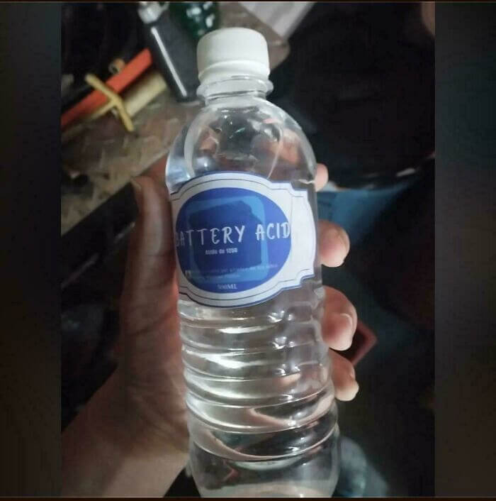
This product design is a head-scratcher. It highlights the importance of thoughtful packaging. Confusing labels could lead to dangerous assumptions. Always read labels carefully to avoid unexpected surprises.
You Might Not See It at First, but Those Are Stairs
At first glance, this sidewalk seems like a typical urban path. But wait, are there stairs? Indeed, this design features steps that blend almost seamlessly into the pavement. It raises questions about practicality and safety, especially for those not paying full attention. Imagine a hurried pedestrian or someone with mobility concerns encountering this puzzling path! It's a head-scratcher, leaving us wondering about its purpose.
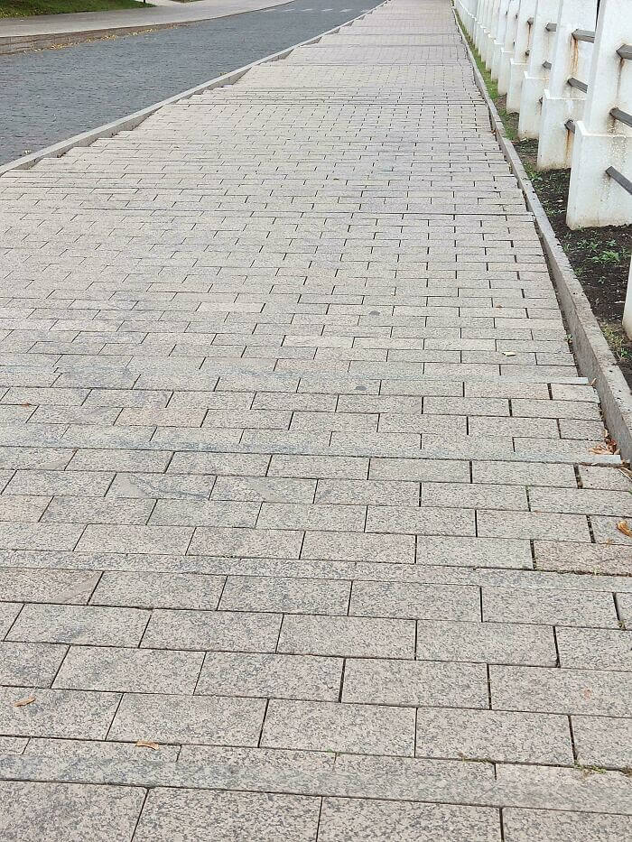
In the world of design, this sidewalk takes the cake for confusion. It's a bizarre blend of flat and stepped surfaces, challenging both logic and pedestrian navigation.
Confusing Entry Sign at the Mall Looks Like a Do Not Enter Sign
Driving up to a shopping center should be straightforward, but this sign might make you pause. It boldly instructs drivers to "Enter Here," yet the design suggests otherwise. With its circular shape and diagonal white line, it closely resembles a "Do Not Enter" sign. This puzzling contrast could leave drivers wondering whether to proceed or turn back. It's a perplexing sight that adds unnecessary confusion to a simple drive.
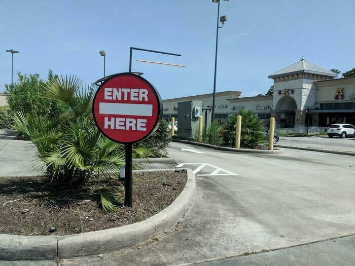
Ultimately, this sign turns a routine task into a moment of bewilderment. Navigating parking lots shouldn't require second-guessing or deciphering mixed signals.
Confusing Hair Product Packaging Looks Like a Cereal Box and Leaves Shoppers Baffled
This product design certainly raises questions, as it looks like a breakfast cereal box rather than a hair bleach kit. The cute cartoon character and colorful stars suggest a fun snack rather than something you'd use for hair treatment. With such a whimsical design, it’s easy to see how shoppers might mistake it for something edible. The mix of playful imagery and a serious product creates a puzzling consumer experience. It's a classic example of style over substance, leaving us scratching our heads.
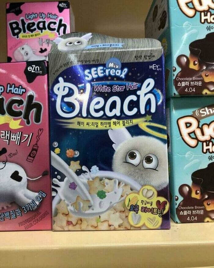
In an age where packaging is everything, this design blurs the lines between hair care and breakfast. A memorable but bewildering choice!
Mix-Up Madness: Hand Sanitizer or Dry Mouth Relief?
In a world where packaging is everything, clarity is key. Yet, this product seems to have missed the memo. At first glance, one might think it's a hand sanitizer. However, a closer look reveals it’s actually dry mouth relief. Such design choices can easily lead to confusion, especially in a hurry. Imagine reaching for relief and applying sanitizer instead. It’s a head-scratcher for sure!
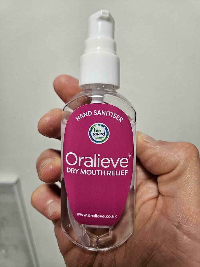
This quirky packaging mix-up serves as a reminder of the importance of clear labeling. Always double-check before use to avoid unexpected surprises.
The Pan That Only Lays Flat if There's Something Weighing It Down
This tiny frying pan raises several questions about its intended use. Is it a novelty item or designed for dollhouse cooking? Its diminutive size might suggest it's not meant for a full breakfast, unless you're cooking for ants. The handle is almost as long as the pan itself, adding to its quirky charm. One wonders if it’s practical or purely decorative; either way, it’s certainly a conversation starter.
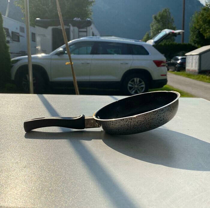
Despite its size, this little pan manages to capture attention and curiosity. Its presence is a testament to how design can surprise and amuse in unexpected ways.
A Bed Frame That Challenges Your Sheet-Fitting Skills - And Constantly Hurts You
Have you ever wrestled with a fitted sheet that simply refuses to stay put? This bed frame design might test your patience like never before. With sharp corners and a snug fit, it turns making the bed into a real challenge. Every attempt to tuck in the sheets leaves you questioning your life choices. It's a battle of wills between the mattress and those pesky corners. Who knew bedtime could be so confrontational?
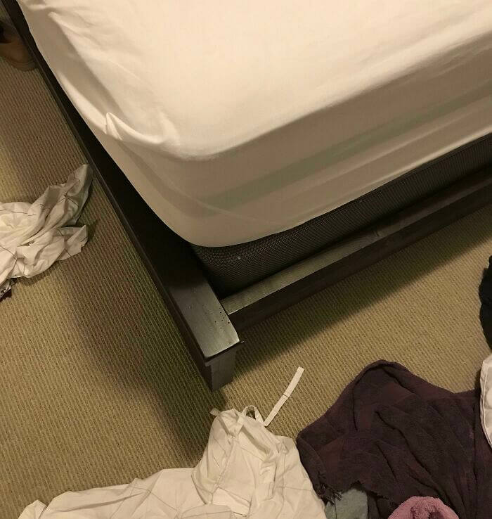
Despite the struggle, there's something oddly satisfying about finally getting those sheets in place. It's a quirky reminder that even the simplest tasks can have unexpected twists.
Tomato Sauce or Plant Food? Read Carefully Before Using
At first glance, this bottle might seem like a delicious tomato sauce, ready to spice up your pasta night. With its vibrant red color and images of juicy tomatoes, it's easy to be fooled. However, a closer look reveals it's actually meant for plants, not your dinner table. The packaging is strikingly similar to a typical sauce bottle, creating quite the culinary illusion. This quirky design could lead to some unexpected taste tests!
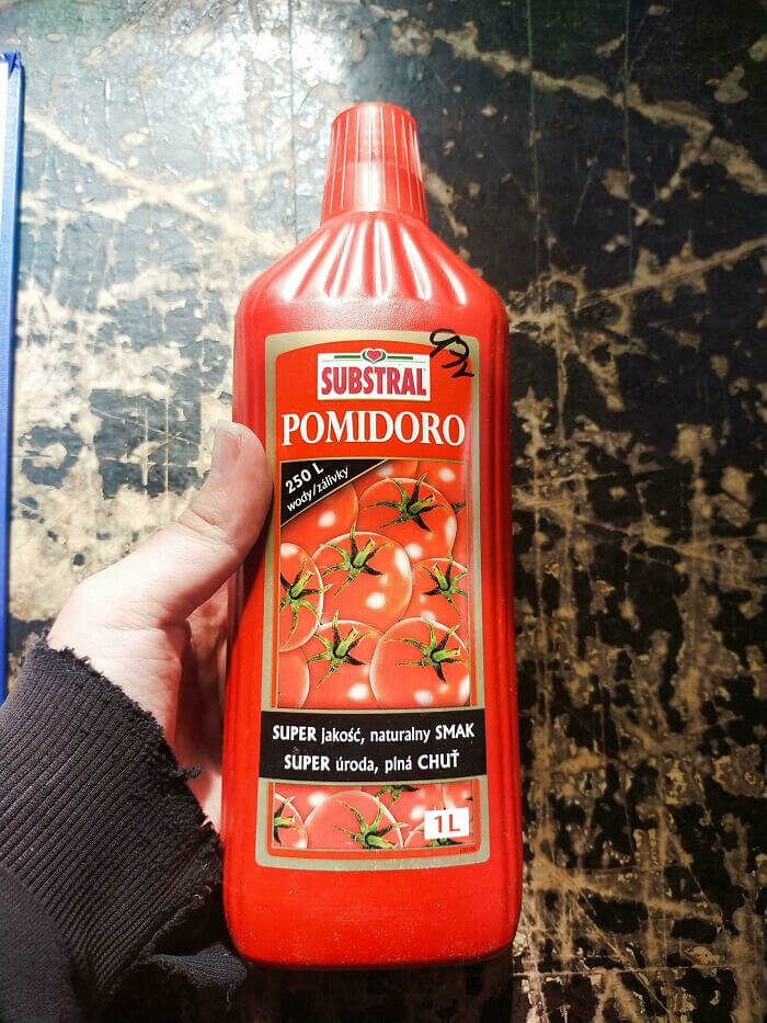
In a world where appearances can deceive, this product stands out as a master of disguise. It serves as a fun reminder to always read labels carefully.
Good Luck to Whoever Gets That Hotel Room
Imagine rounding a spiral staircase only to face a puzzling sight. The steps continue upward, but oddly, they lead straight into a door, with no landing in sight. This baffling design choice seems to defy logic. Accessibility and practicality appear to have been afterthoughts in this peculiar layout. Was it an architectural oversight, or a deliberate design to bemuse visitors? It's a real head-scratcher for sure.
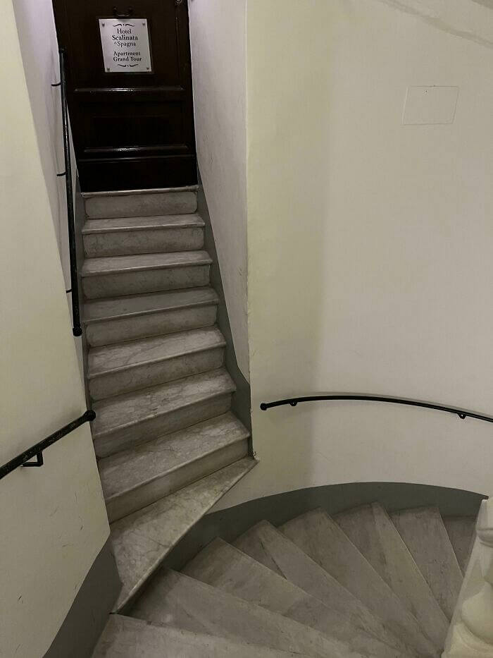
A staircase leading straight into a door without a landing seems like a design puzzle. It's a whimsical reminder that not all architectural choices make sense at first glance.
Gas Torch With Meltable Parts... Genius Combination
At first glance, this gas torch looks like a standard tool for culinary or workshop purposes. However, a closer look reveals a perplexing design decision. The position of the trigger seems awkwardly placed, potentially risking accidental activation. The blue and black color scheme suggests utility, but practicality seems sacrificed for aesthetics. One can't help but wonder about the usage experience. It's a design that truly leaves us scratching our heads.
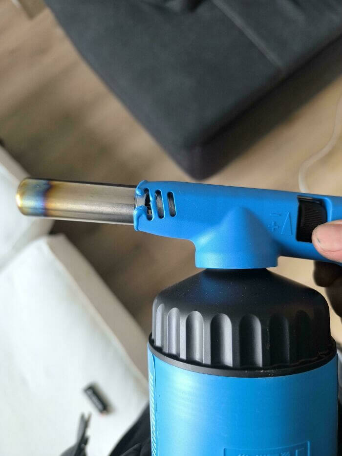
Despite its initial appeal, the torch's usability might leave users questioning its practicality. A small design tweak could significantly enhance safety and user experience. Perhaps this is a case where form didn't quite meet function.
The Reality of "bike-Friendly" Cities
In a baffling design choice, a bicycle lane is interrupted by a pole firmly planted in its path. Cyclists are left to wonder how this oversight occurred and navigate around it daily. The lane, clearly marked for bikes, seems to have been an afterthought where practicality meets confusion. This quirky design misstep raises eyebrows and questions. How do such design decisions come to life on our roads?
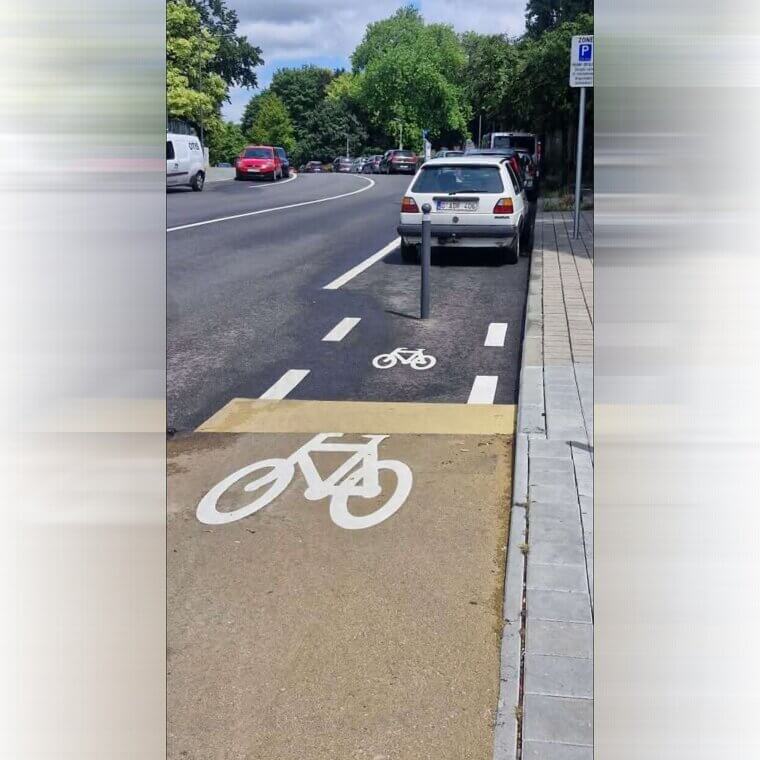
Perhaps the planners intended to challenge cyclists or maybe just missed this crucial detail. Either way, this design leaves everyone scratching their heads in disbelief.
Makes You Want to Crack Open an Ice Cold... Surface Cleaner?
This surface cleaner comes in a can that looks suspiciously like a refreshing beverage. The design could easily lead one to think it's a soft drink, especially with the prominent "green tea + lime" labeling. Imagine reaching for a soda and ending up cleaning your table instead! The unusual packaging choice certainly makes you take a second look. It’s a surefire way to keep your countertops spotless, but maybe also your palate puzzled.
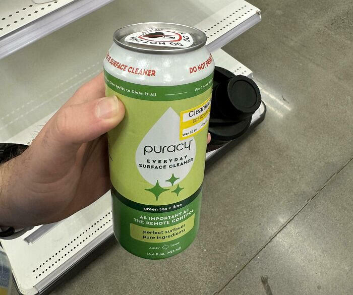
The design choice seems to blur the lines between a drink and a cleaning product. While it’s a clever way to stand out, it might lead to accidental swigs.
The Awkwardly Slanted Table Edge That's Good for Nothing
Imagine reaching for your glass only to be met by a table corner that pokes back at you. This design choice leaves much to be desired, merging functionality with frustration. The oddly shaped table edge seems to defy the basic principles of comfort and usability. One might wonder if aesthetics took precedence over practicality in this case. It's a head-scratcher that makes you think twice about placement and design.
While it may look unique, the table's design falls short in everyday use. This head-scratching design surely isn't winning any awards for comfort or utility.
Not-Safe-For-Children yet Decorated for Kids
In a puzzling blend of kitchen utility and playful art, these knives sport cartoon designs. Each blade flaunts a quirky illustration, ranging from animals to whimsical scenes. While they might catch the eye, their purpose leaves us scratching our heads. Do these vibrant graphics enhance the cooking experience or simply add confusion? Perhaps it’s a bold attempt to make meal prep more entertaining. A conversation starter, if nothing else.
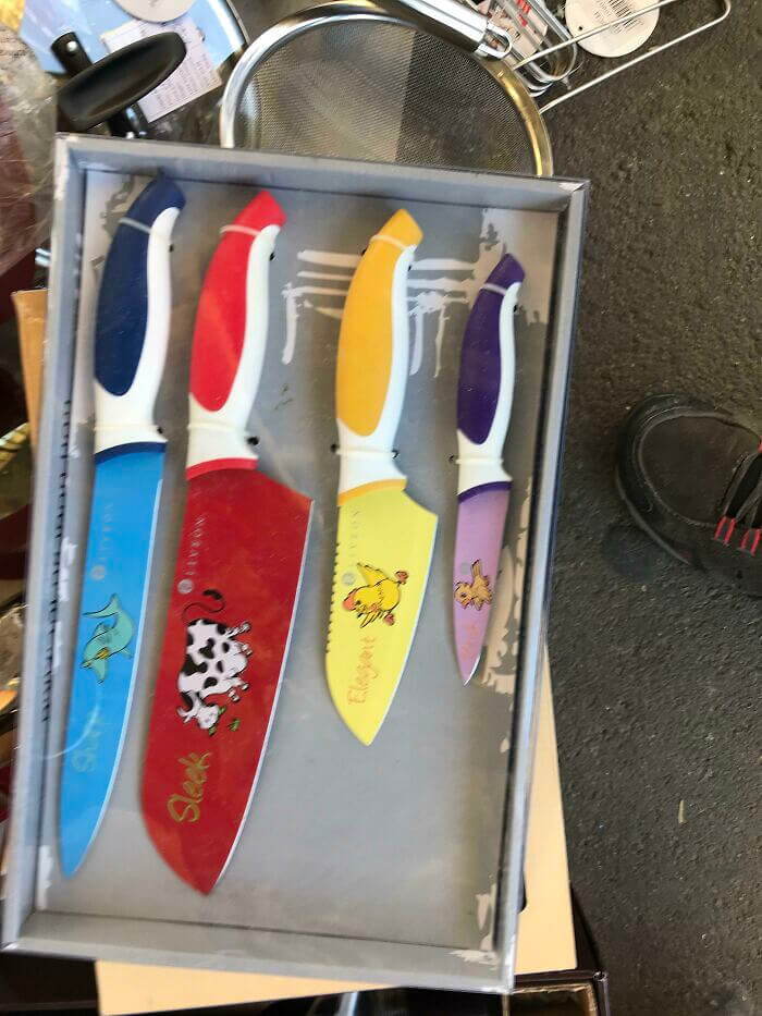
Despite the cheerful designs, these knives make one question their practicality. Are they a creative hit or a confusing miss? Only the users can decide.
Triangular Chair Conundrum - You Can Sit, but You Won't Enjoy It
This peculiar chair design has left many wondering about its comfort and practicality. With a triangular seat that challenges traditional seating norms, it seems more like a modern art piece than a functional chair. The minimalist metal frame adds to its unconventional allure, but one has to question the stability and comfort it offers. It's certainly a conversation starter, but would you dare sit on it? The design pushes boundaries, teetering on the edge of innovation and impracticality.
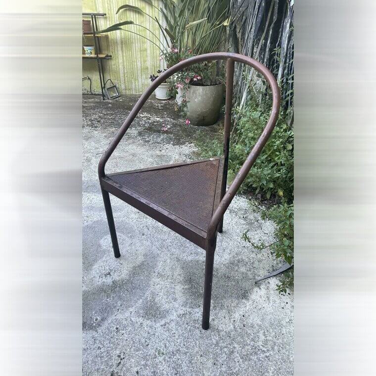
Despite its artistic appeal, this chair raises practical questions. Is it a statement piece or a seating solution? Such designs blur lines, leaving us pondering their true purpose.
So Is That the off Button or the Temperature Adjuster?
This glue gun design has us puzzled with its wattage choices. The single switch offers options for 60W and 100W, but there’s only one button. Are users supposed to guess the power level, or is there a hidden mechanism we’re missing? It seems straightforward at first glance, yet the implications of using the wrong setting could be problematic. How could such a simple tool pose such a conundrum?
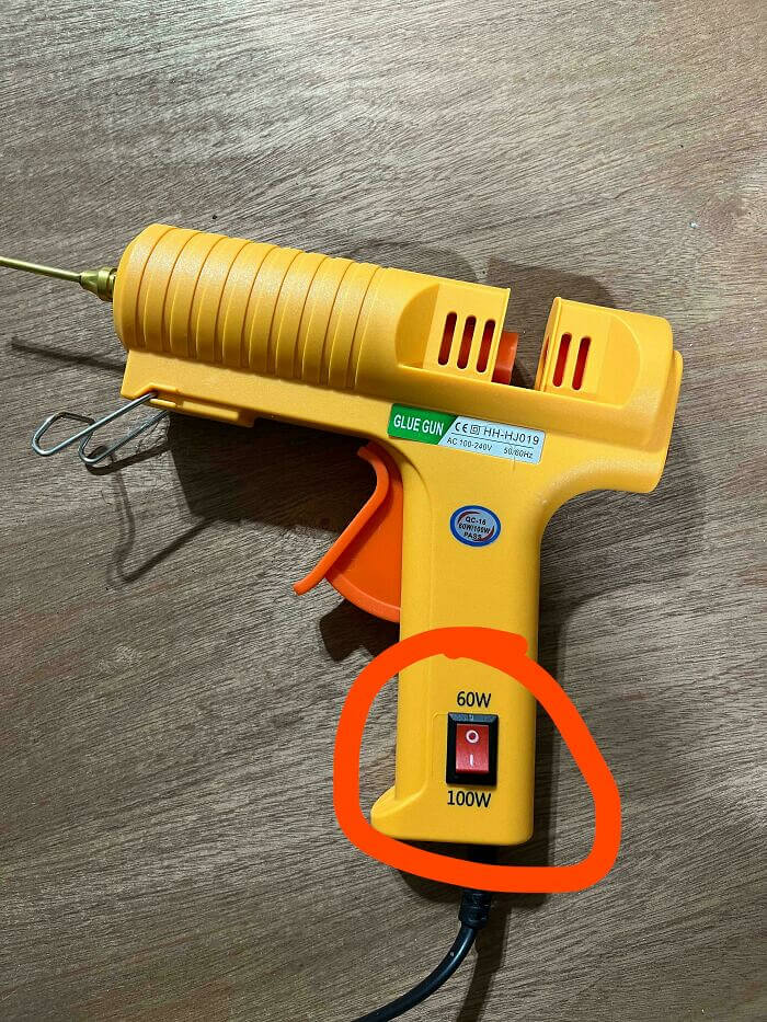
In the world of glue guns, clarity is key. This design, however, leaves users scratching their heads. Simplicity should never compromise functionality or safety.
The Gravity-Defying Building Built for Engineers - And Ironically Had to Be Closed Down
At first glance, this building seems to defy the laws of physics. With its top-heavy design and narrow base, one might question how it remains standing. It almost looks like an architectural magic trick or an optical illusion meant to intrigue and confuse. The stark contrast between the wide upper floors and the slender support below adds to its mystique. It’s a bold statement in urban design.
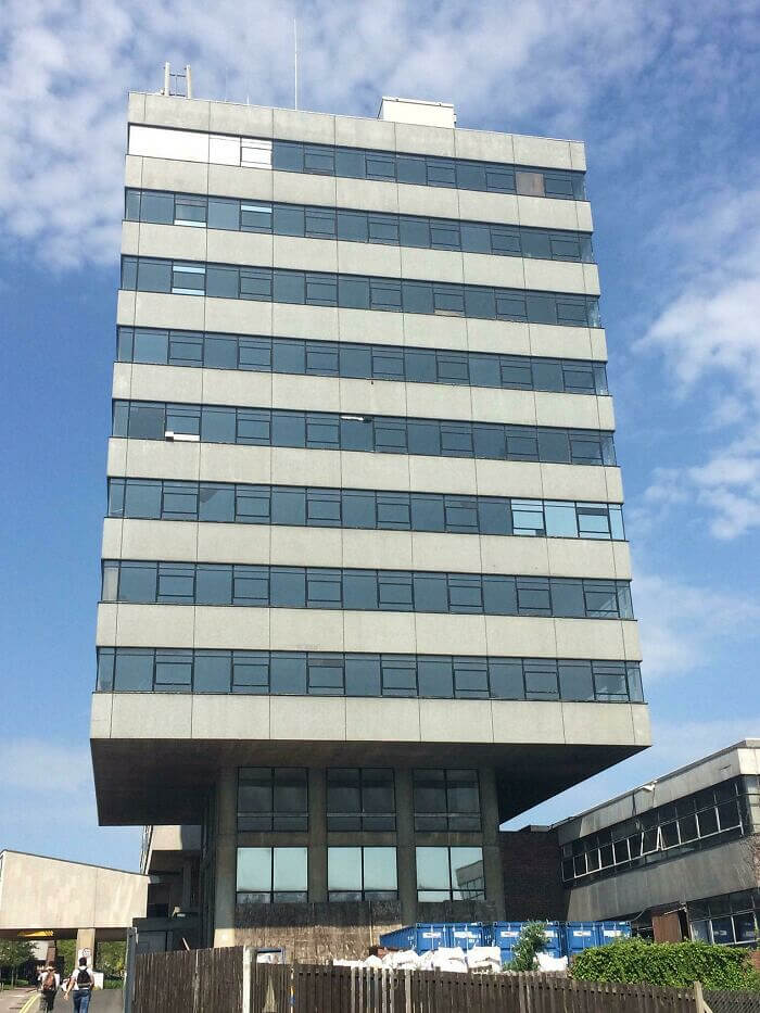
This building certainly leaves us pondering the creativity and audacity of modern architecture. It challenges our perceptions and invites curiosity. Would you dare to step inside?
Nothing Says "visitors NOT Welcome" Like a Painful Door Handle
At first glance, this door handle certainly catches your eye with its unique, spiral design. Yet, one can't help but wonder about its practicality. The spiral form may look intriguing, but is it comfortable to grip? The choice of metal seems sturdy, but does it feel cold or slippery to the touch? This design might raise questions about user experience over aesthetic appeal. Functionality may have taken a backseat here.
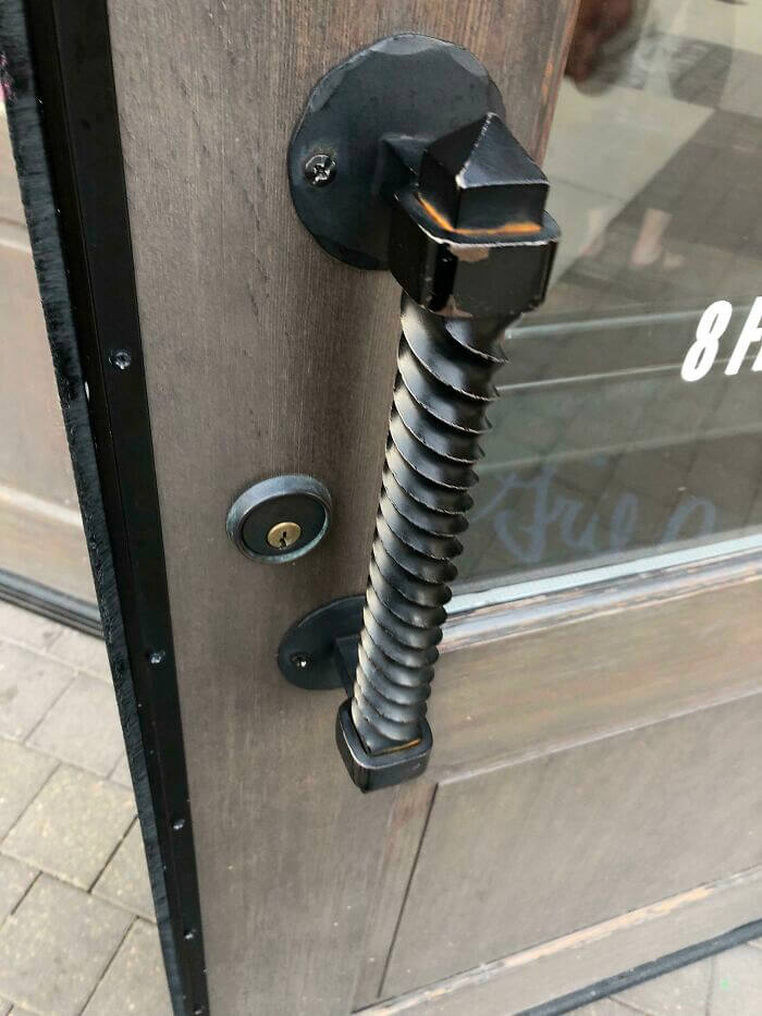
While this design is visually interesting, practicality might be sacrificed for style. It's a bold choice, but perhaps not the most user-friendly. A real head-scratcher for sure.
Welcome Visitors Enter Through the Door on the Right, Others Enter Through the Door on the Left
Imagine stepping into a home where the front door opens directly onto a staircase. This unusual design choice might leave guests feeling like they've landed in a funhouse. The door's elegant stained glass contrasts sharply with the abrupt descent that awaits. It's a head-scratcher for sure, merging style with the unexpected. One has to wonder about the thought process behind this peculiar entrance.
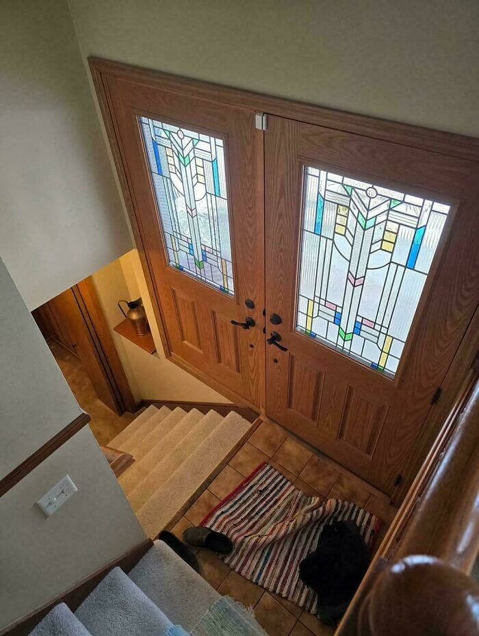
While it may seem impractical, this design certainly sparks conversation. It challenges our expectations of home layouts, offering a quirky twist on the mundane.
This Isn't a Roller Coaster, It's a Not-So-Accessible Accessibility Ramp
These stairs are a curious blend of function and puzzlement. At first glance, the peculiar, wavy handrails catch your attention, offering a hint of whimsy. However, the design leaves one pondering its practicality. The undulating pattern seems more decorative than useful, possibly creating challenges for those needing support. This quirky staircase truly embodies an artistic approach that sacrifices functionality for flair, leaving us scratching our heads in bemusement.
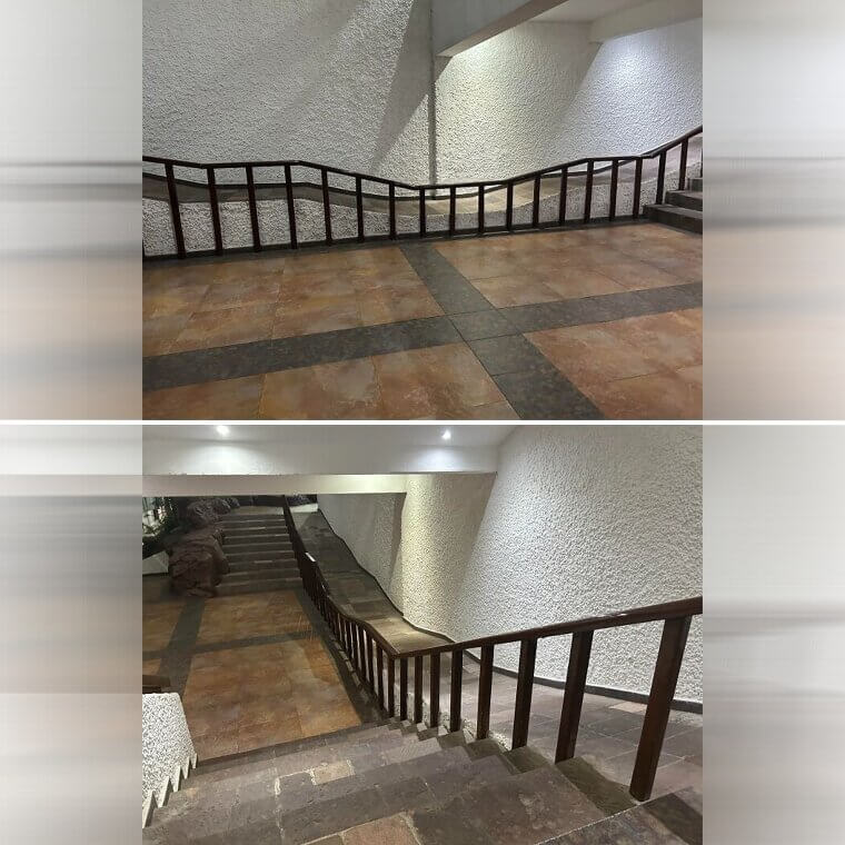
Is this design a creative stroke of genius or a head-scratching mystery? While it certainly stands out, its usability remains questionable.
Water Feature in the Mall Turns Out to Be a Human Safety Hazard
Strolling through a shopping mall is usually a straightforward experience, but this design choice might have you puzzled. A water feature in the middle of the walkway, surrounded by chains and caution signs, seems to serve more as a barrier than a decorative piece. The placement raises questions about functionality versus aesthetics. Is it a serene escape or a tripping hazard? This peculiar setup definitely raises eyebrows.
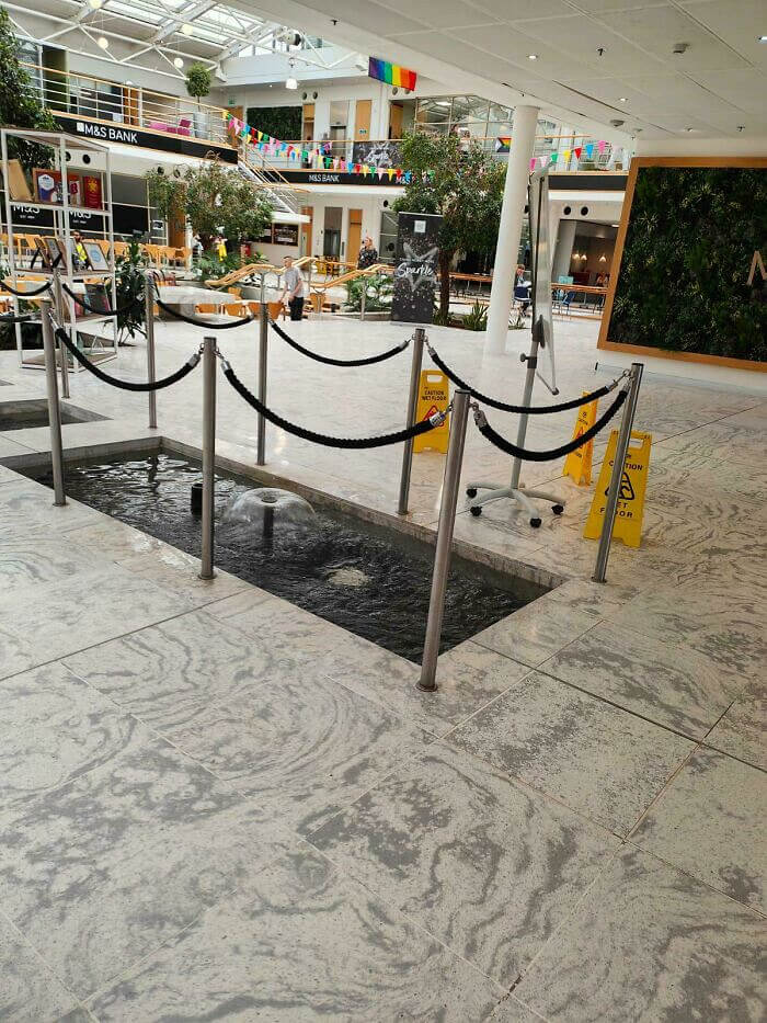
In the grand scheme of mall design, this water feature stands out as an unconventional choice. Whether it adds charm or confusion is up for debate.
Elmer's Delicious Mistake?
Have you ever glanced at a product and wondered if it was designed to confuse you deliberately? This jar certainly seems to fit the bill. With its enticing "hot chocolate" label, one might think it’s a delightful treat waiting to be enjoyed. However, the iconic Elmer's logo reveals its true identity as a gooey crafting material. The unexpected pairing of flavors and functions leaves many scratching their heads in bewilderment. Is it dessert or a craft supply? The world may never know.
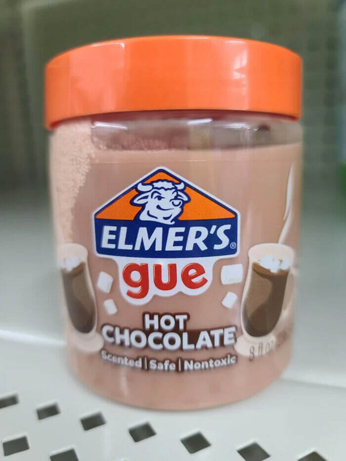
This peculiar product design is both amusing and baffling. While its branding might lead to confusion, it undoubtedly captures attention and sparks conversation.
Confusing Pineapple Lamp Design - Turn on and off at Your Own Risk
At first glance, this lamp design leaves us wondering about its inspiration. Featuring a pineapple motif, it's both intriguing and perplexing. The unique blend of tropical fruit and practical lighting makes one question the designer's vision. The stark contrast between the lamp's base and light fixture adds to its mystique. It's a functional piece, yet its aesthetic choices are undeniably puzzling. This design certainly keeps us guessing.
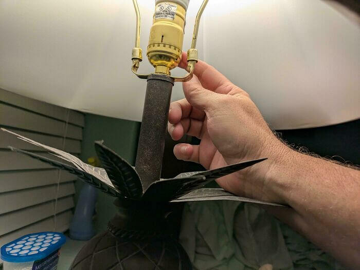
Despite its odd appearance, this lamp remains a conversation starter. Its quirky style challenges conventional design norms. If nothing else, it offers a bright twist on home decor.
Steel Bench: Burning Hot in the Summer, Freezing Cold in the Winter
This bench presents an intriguing design that prioritizes style over practicality. Its sleek, minimalist lines are visually striking, yet leave us wondering about comfort and usability. The metal bars, while aesthetically pleasing, might not offer the most inviting seating experience. It's a piece that makes a bold statement, but raises questions about its actual purpose. Is it art, or is it furniture? This design blurs the lines.
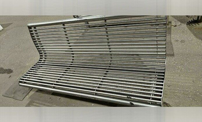
Ultimately, this bench challenges traditional seating concepts, offering an aesthetic appeal that may not align with comfort. Its unique approach certainly sparks conversation about design priorities.
Pool Ladder: A Dive into Design Confusion
Stepping into a pool should be easy, right? But this ladder design makes you question its intention. Positioned humorously and seemingly unreachable, it's as if someone played a prank on swimmers. The design choice here leaves one pondering whether it's an art installation or a genuine attempt at utility. It's a head-scratcher that turns a simple swim into a puzzling endeavor. With laughter and confusion, this design certainly stands out.
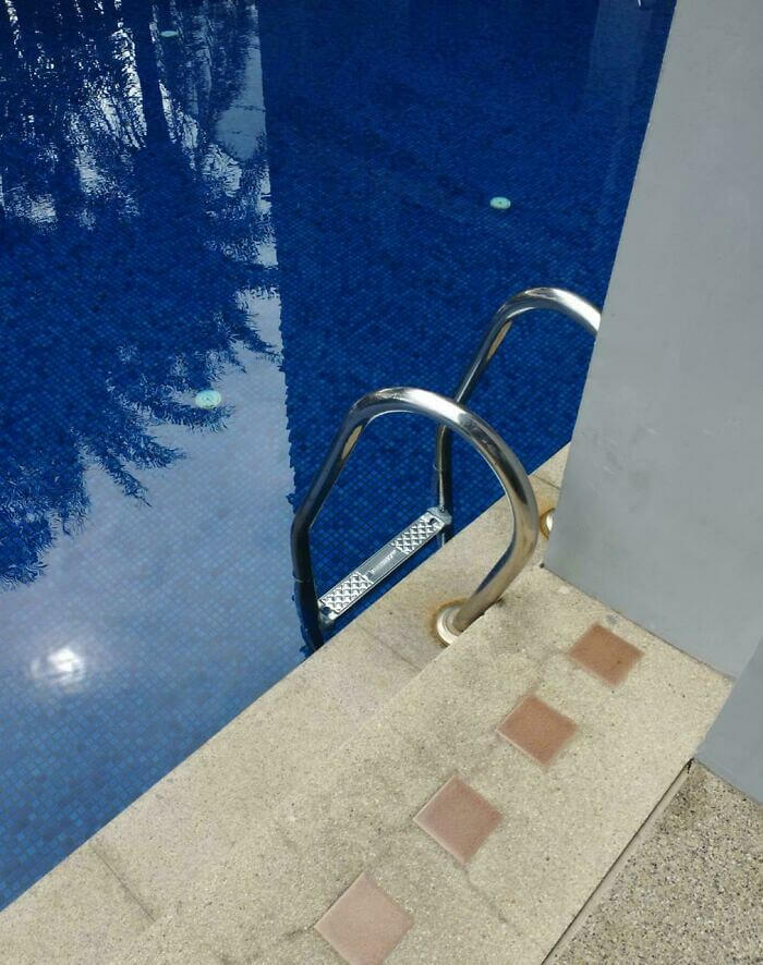
In a world of innovative designs, sometimes practicality takes a backseat. This pool ladder raises more questions than swimmers, adding a quirky twist to poolside fun.
The Building Entrance That Doubles as an Obstacle Course
This entrance design seems to challenge visitors with an unofficial obstacle course. Paved sections appear haphazardly placed, leaving significant gaps that demand careful navigation. The layout raises questions about its intended purpose versus its practical function. Walking across requires more attention than usual, potentially turning a simple entry into a balancing act. It leaves one pondering the designer's intentions and the inevitable mishaps that might occur.
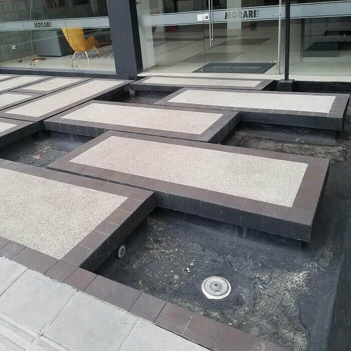
Despite its perplexing design, the entrance certainly leaves a memorable impression. Visitors might find themselves chuckling or puzzled by the unusual layout, adding some unintended excitement to their visit.
Floating Wall Wonder: Anyone Walking on the Sidewalk Must Duck Down or End up Looking Like a Cartoon Character
In a neighborhood where everything seems ordinary, a curious architectural feature stands out. A wall appears to precariously jut out over the sidewalk, defying logic and gravity. Its unconventional design leaves pedestrians bewildered, wondering about the structure's purpose. Is it an innovative architectural statement or a baffling oversight? This puzzling protrusion exemplifies design that challenges conventional thinking, leaving passersby amused yet perplexed. Could it be a futuristic trendsetter or just a quirky mistake?
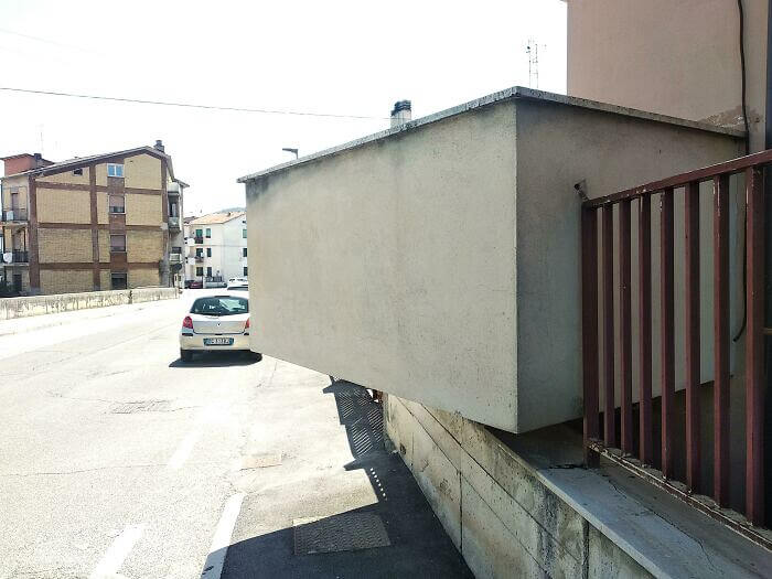
This intriguing design choice raises eyebrows and sparks conversation. Is it a creative leap or simply a peculiar misstep? Such mysteries keep the world of design endlessly fascinating.
Would've Worked Better if the Charging Station Worked With Bluetooth
In the quest for eco-friendly solutions, electric charging stations are crucial. However, placing them across a pedestrian pathway might not be the best design choice. Long cables stretch across the walkway, posing a tripping hazard for unsuspecting walkers. This setup might charge cars efficiently, but it also charges up some safety concerns. A quick fix or a thoughtful redesign could prevent an unfortunate mishap.

Ultimately, thoughtful placement can make a world of difference. Addressing such design oversights can enhance both safety and usability. Let's hope this gets resolved soon!
Diesel Treat or Iced Tea? Confusing Packaging Alert!
At first glance, you might mistake these bottles for a refreshing drink meant for a summer day! The amber liquid inside and bold labels are reminiscent of iced tea packaging, but these bottles actually contain diesel conditioner. This design choice could easily lead to confusion for unsuspecting shoppers. A closer look reveals warnings that prevent any mix-up, yet one can’t help but wonder if this design is truly effective. Perhaps a more distinct appearance would prevent any potential mishaps. Sometimes, clear communication beats clever design!
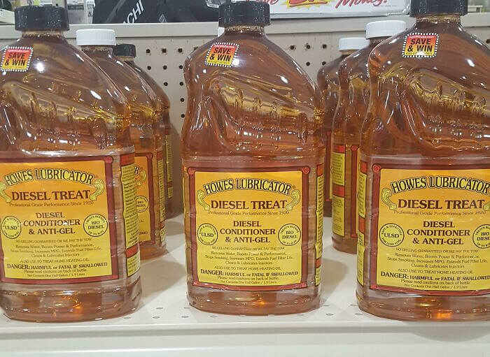
Next time you’re shopping, remember to look twice before you grab. Distinct labels can prevent an accidental, and possibly hazardous, mix-up. Always read carefully!
When the Light Switch Is Located Right Between the Fire Alarm and the Door Release
In a world where clarity is key, this design leaves us scratching our heads. The fire alarm and door release buttons are stacked with a light switch crammed in between. This arrangement demands a moment of thought in emergencies, which isn’t ideal when seconds count. The color coding helps a bit, but the unconventional placement might lead to unnecessary panic. A rethink could clear up the confusion.
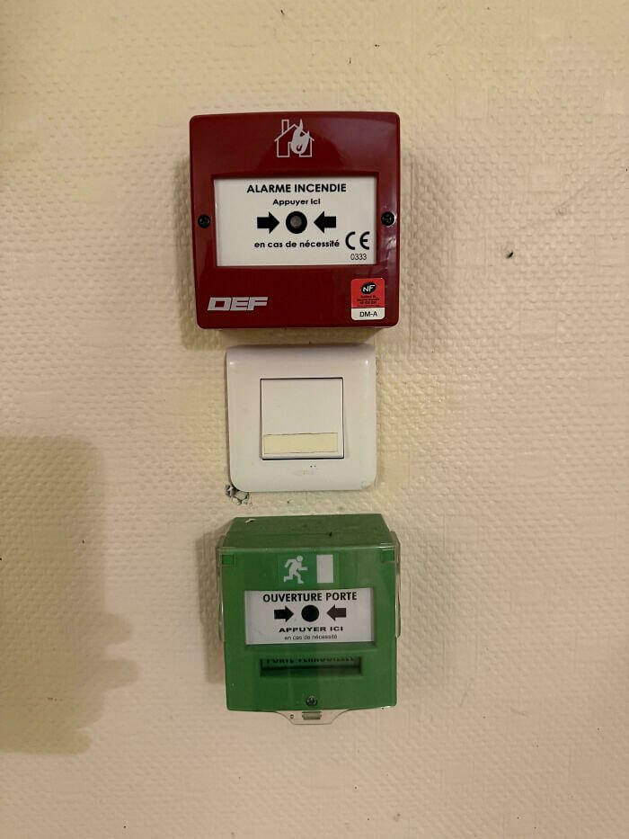
While the intention might have been practical, the execution falls short. A clearer separation would provide users with immediate understanding, ensuring both safety and efficiency.
Staircase Steps to Confusion
This staircase design is certainly an attention-grabber, but perhaps not for the right reasons. Its peculiar alternating tread pattern might make one question its usability more than its artistry. Navigating these steps could require a bit of a balancing act, as each step presents a new challenge. Safety seems to have taken a backseat in the quest for a unique design. It's an architectural choice that might leave some feeling dizzy.
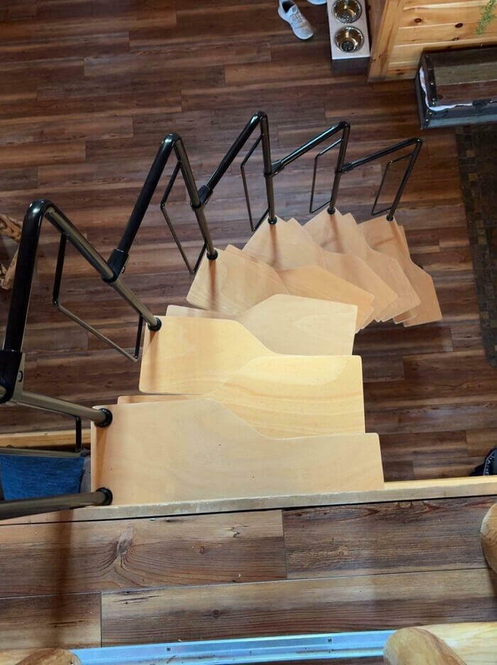
Despite its innovative approach, this staircase might test the nerves of even the most adventurous. It's a bold move that prioritizes aesthetics over functionality.
Many a Buyers Have Accidentally Eaten This - But It's Not Edible
At first glance, you might think you're holding a delicious gummy fish, but look again! This product is actually a squishy toy, cleverly disguised in candy-like packaging. The playful design, with its vivid colors and playful fonts, had us questioning its true purpose. It's labeled "Sweet-Ish Fish," providing a humorous reminder that this isn’t a treat. It's a prime example of packaging that leaves us scratching our heads.
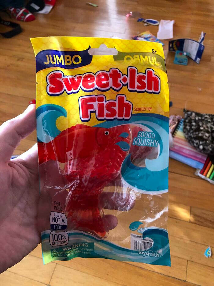
While the packaging is amusing, it clearly states that it's not a food item. This adds a layer of humor and ensures no accidental snacking.
The Perfect Slide for Kids... Not
Imagine the excitement of reaching the top of a shiny slide, only to realize it's leading you into a pile of logs and a fence. This peculiar setup leaves us pondering the intentions behind the design. Was it meant to challenge park-goers, or did someone forget to check the landing zone? With its abrupt end, this slide truly exemplifies a head-scratching moment in playground planning. It’s a curious scene that raises more questions than answers.
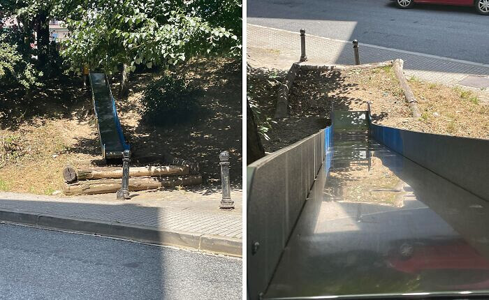
While designs often aim to delight, this slide presents an unexpected twist. Perhaps next time, a little more attention to detail will lead to a smoother landing!
Well, We Hope They Never Have Issues With Their Toilet - Fixing It Would Require a Bathroom Remodel
Imagine walking into a restroom to find a toilet squeezed awkwardly beneath a countertop. This design choice leaves us wondering what the planner was thinking. The countertop stretches over the toilet, making it nearly impossible to use without a balancing act. Was this an attempt to save space or a design oversight? Either way, this baffling setup is sure to leave users puzzled and uncomfortable.
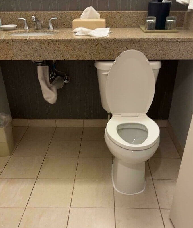
In a world full of creative solutions, some designs just miss the mark. This setup is a prime example of functionality taking a back seat.
We've Seen the Future, and It Might Include Standing Airplane "seats"
These airplane seats seem to defy the typical notions of comfort and space. With a design reminiscent of standing more than sitting, they invite questions about practicality and passenger experience. The upright posture might suit short flights, but long-haul travelers may grimace. While they maximize seating capacity, one wonders about the sacrifice of comfort. Are these seats a glimpse into the future of budget travel?
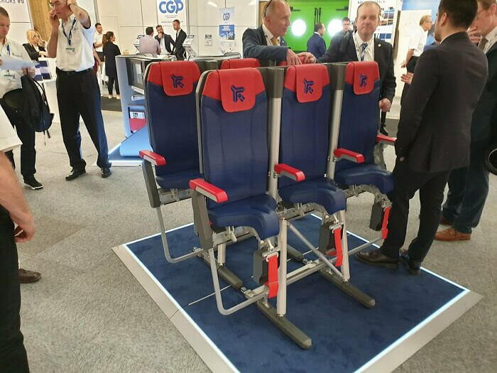
As airlines look for innovative solutions, these seats may spark debate. Balancing efficiency with comfort will be key. Will passengers embrace this minimalistic approach, or resist the change? Only time will tell.
The Law Changes Between 3pm to 8pm
Navigating traffic signs can sometimes feel like deciphering a complex puzzle, and this particular sign is no exception. At first glance, it seems straightforward, but a closer look reveals a jumble of arrows and times that can easily baffle drivers. Between 3 PM and 8 PM, the rules shift, adding an extra layer of confusion. The design seems to require a degree in hieroglyphics to interpret correctly. Drivers must stay alert and decipher the details quickly, adding stress to their commute. It’s a reminder that even simple road signs can become a perplexing challenge.
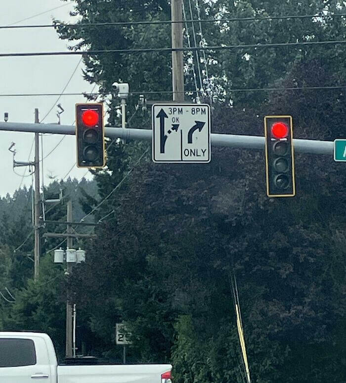
In a world where clarity is crucial, signs like these leave drivers scratching their heads. Simplifying design could improve safety and reduce confusion on the road.
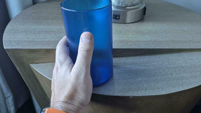
Water Bottle Lip Lock Dilemmas
Here’s a water bottle design that challenges the way we hydrate. The bottle’s cap has a loop that seems like it might work as a handle, but instead, it awkwardly pokes the nose while drinking. It’s an unexpected obstacle to quenching thirst efficiently. Perhaps the designer aimed for chic aesthetics, but practicality seems to have slipped through the cracks. This design definitely leaves us pondering its usability.
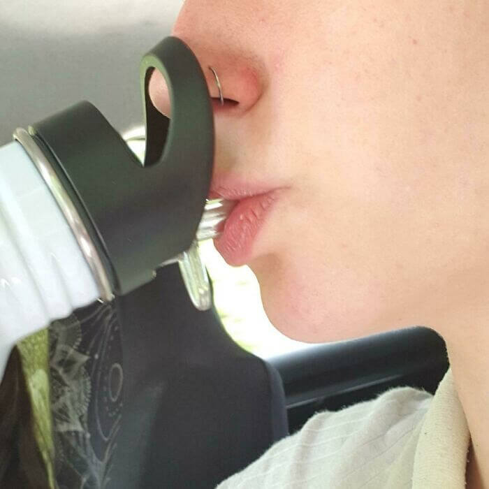
It’s a quirky twist on the classic water bottle, but maybe not for the better. While it certainly grabs attention, it might leave users more puzzled than refreshed.